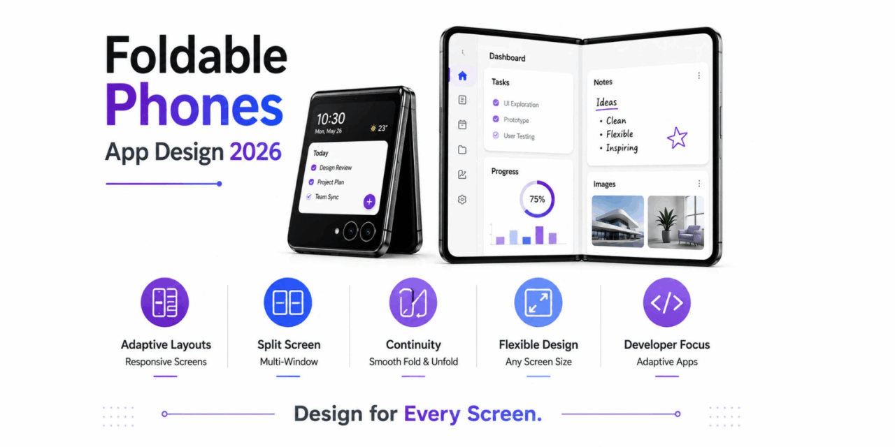
Foldable phones have moved from a genuine novelty into a meaningfully growing segment of the smartphone market, and their unusual form factor, a phone that unfolds into something closer to a small tablet, has forced app developers to rethink layout assumptions that held reliably for years when nearly every phone shared roughly the same fixed aspect ratio. By 2026, designing an app that only looks good on a standard phone screen increasingly means missing a genuine opportunity to take advantage of a foldable’s larger unfolded display, or worse, actually breaking visually when a user unfolds their device mid-use. This shift affects far more developers than just those building dedicated foldable-specific apps from scratch.
Adaptive Layouts Over Fixed Designs
Apps designed specifically for foldables increasingly use adaptive layouts that reflow content intelligently based on available screen space, rather than assuming one fixed phone-sized layout will simply scale acceptably to a much larger unfolded display.
Multi-Window and Split-Screen Support
Foldable devices have pushed genuine demand for proper multi-window and split-screen support, letting users run two apps simultaneously side by side on the larger unfolded screen, a capability that requires deliberate design consideration rather than assuming a single full-screen app view.
The Continuity Challenge
Apps need to handle the genuine transition moment when a user folds or unfolds a device mid-session smoothly, preserving state and adjusting layout without a jarring visual break or, worse, losing unsaved user input during that transition.
Platform Tools Catching Up
Both Android and iOS have introduced genuinely improved development tools and design guidelines specifically for foldable and large-screen support, making it easier for developers to build adaptive layouts without reinventing responsive design patterns from scratch each time.
The practical impact for most developers has been a gradual but genuine shift toward treating screen size and aspect ratio as a spectrum to design for rather than a small handful of fixed device categories, a mindset shift that also happens to improve an app’s experience on standard tablets and various phone sizes beyond foldables specifically. Larger, well-resourced apps have led on foldable-specific optimization, since the engineering investment pays off more clearly at their user scale, while smaller developers often rely on their underlying framework’s default adaptive behavior rather than building bespoke foldable-specific layouts themselves. This trend connects to a broader pattern of device diversity discussed in earlier coverage of the app market, where developers increasingly need to design for a genuinely wider range of contexts rather than a single dominant device shape. Testing an app directly on a foldable, even a borrowed one, tends to reveal layout issues far faster than relying purely on an emulator’s simulated fold behavior.
Foldable phones have pushed app design toward genuinely more flexible, adaptive layouts that serve users well across a wider range of screen sizes and orientations, a shift that benefits the broader app ecosystem beyond foldable owners alone. Developers who invest in adaptive design now are building apps genuinely more resilient to whatever device shape comes next, rather than solving narrowly for today’s most common phone form factor alone. That flexibility tends to pay off in ways that go well beyond foldable owners, benefiting anyone using an app on an unusually sized or oriented screen, not just those who actually own a foldable device themselves, since good adaptive design quietly raises the baseline experience for everyone.